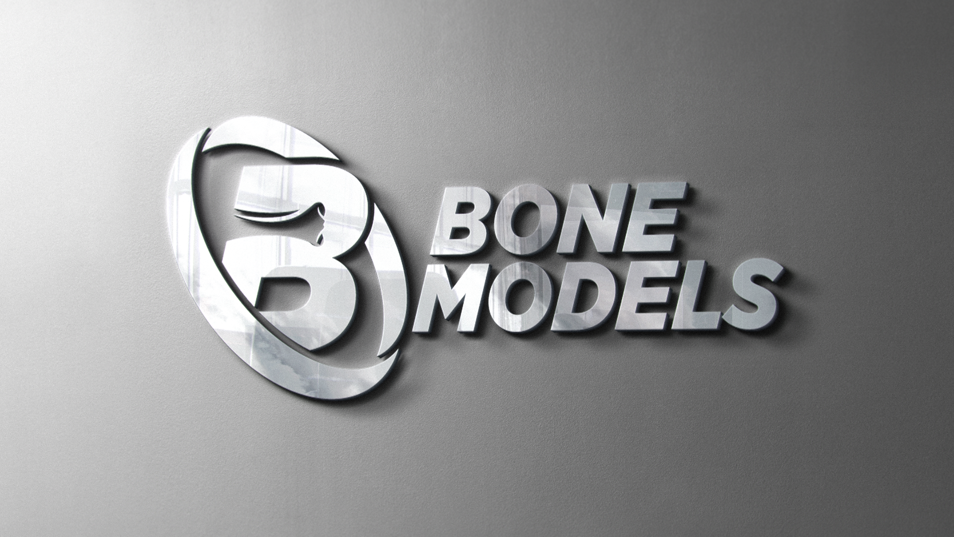
A Clear Identity for a Specialized Industry
Bone Models is a one-stop resource supporting dental and orthopedic professionals with high-quality anatomical models and training tools. Formerly known as Models Plus, the company sought a new logo that more accurately reflected both their name and their role within the medical industry. The rebrand focused on creating an identity that felt credible, modern, and instantly recognizable, aligning the visual language with the expertise and craftsmanship behind their products.
From Exploration to the Aha Moment
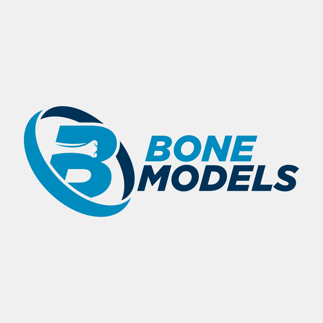
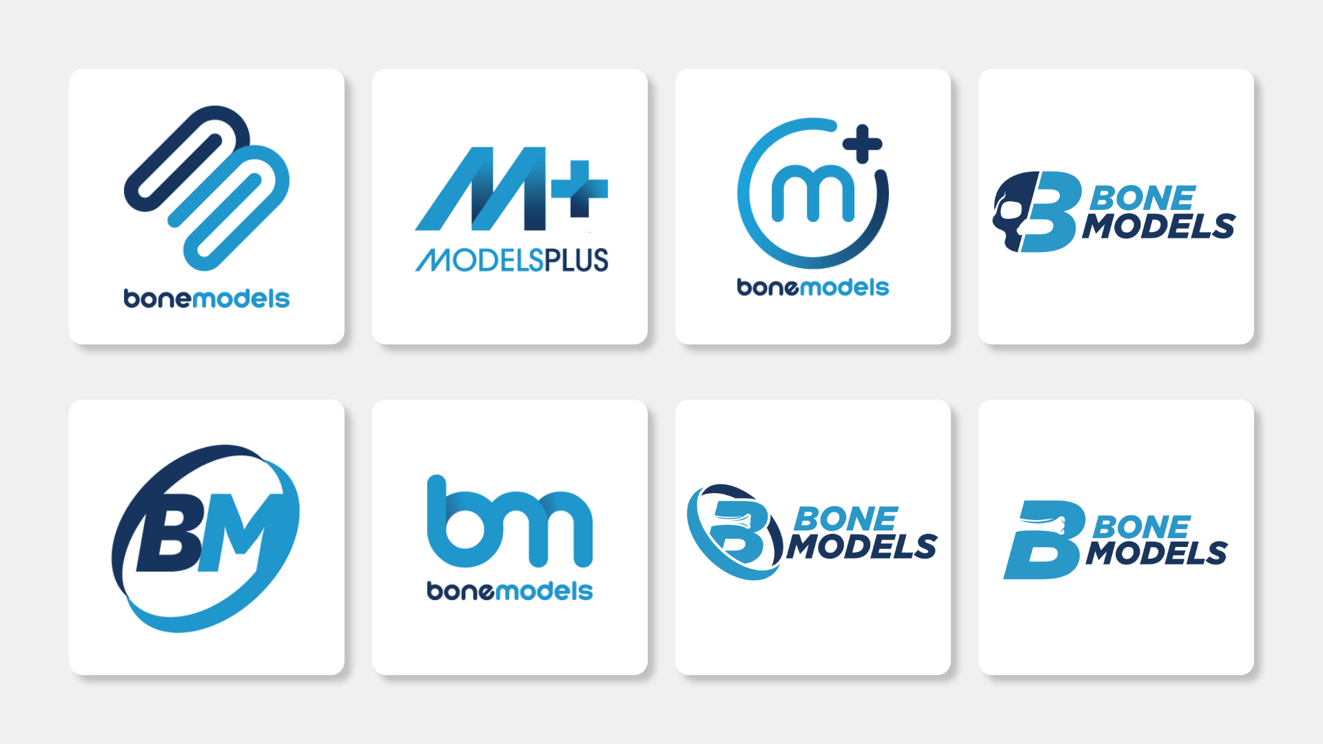
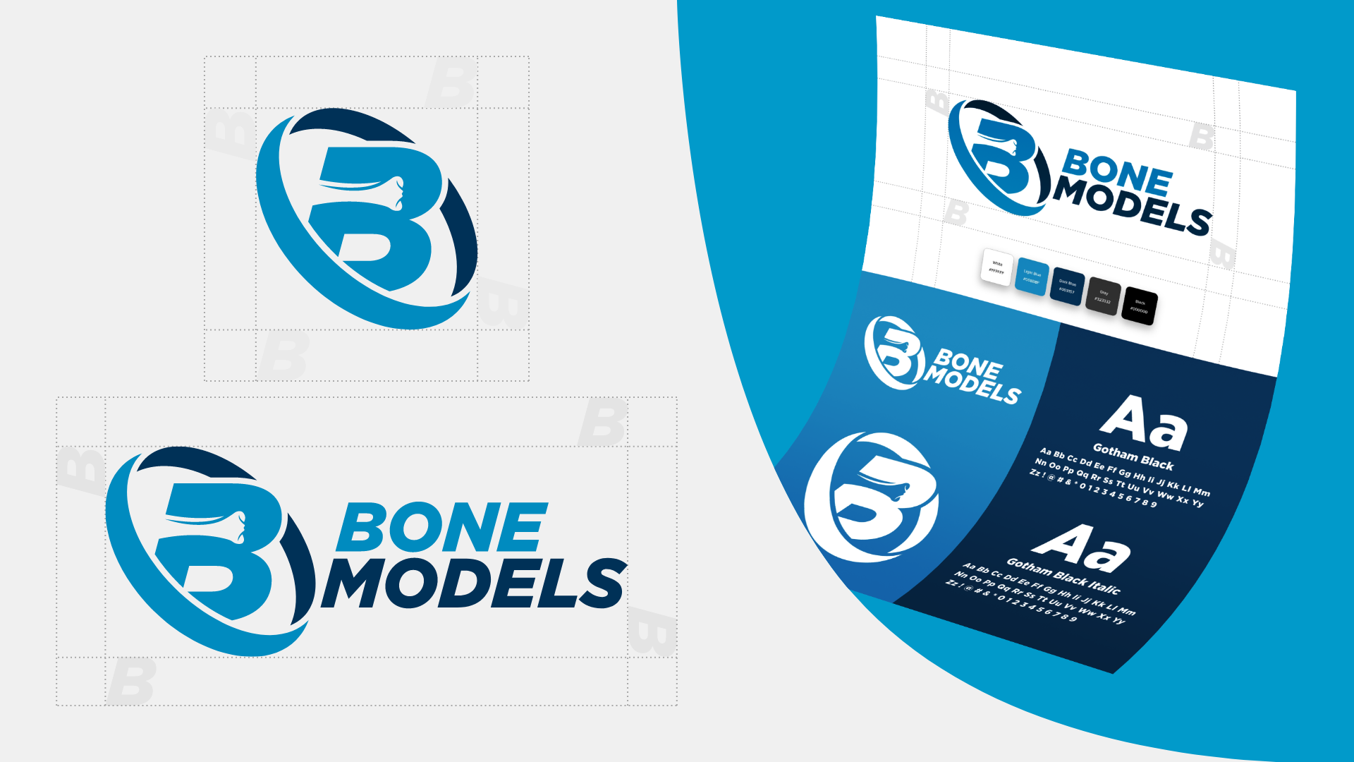
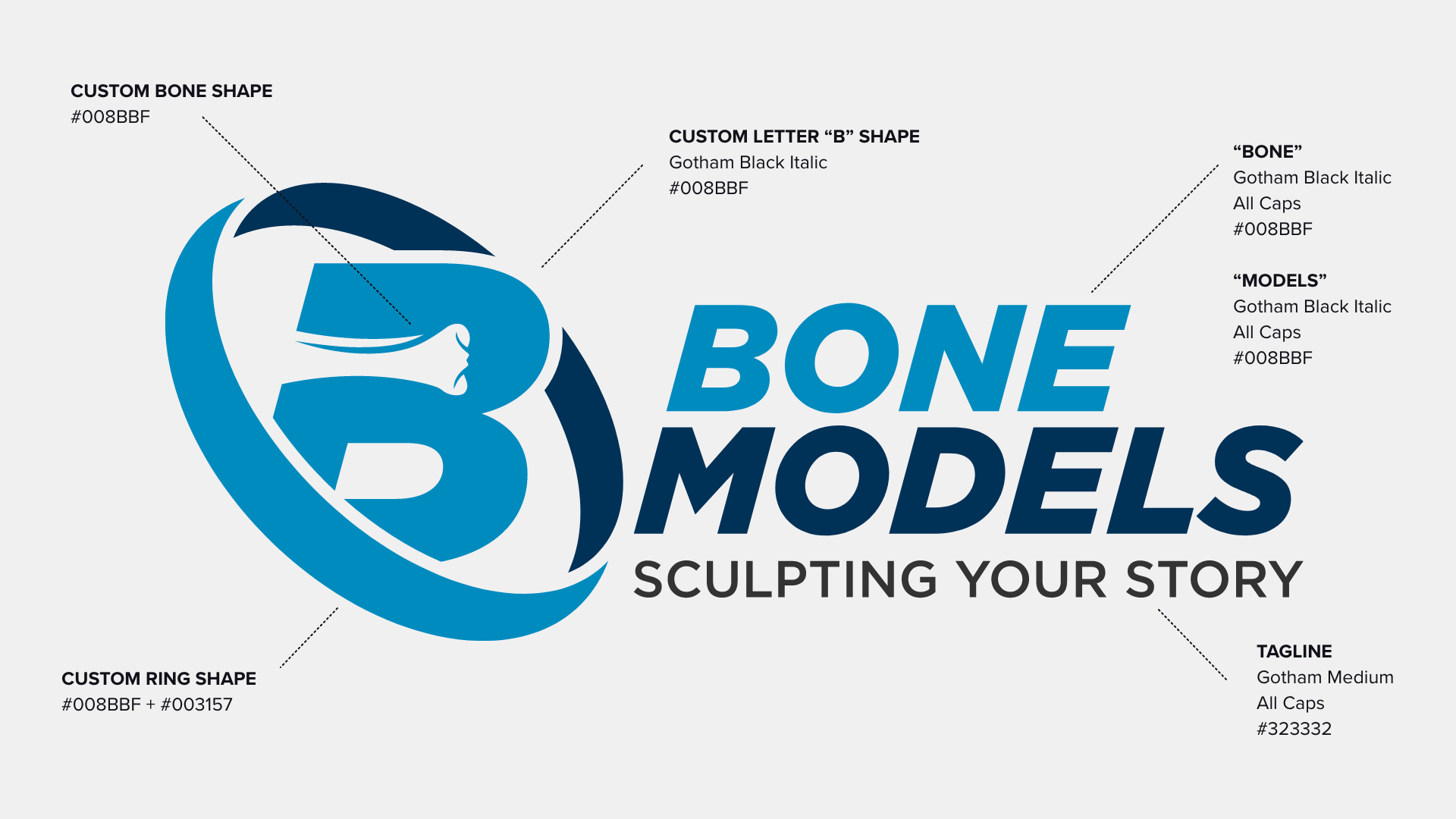
The logo design process involved multiple iterations, exploring ways to visually represent Bone Models without relying on obvious or overused symbols. The client wanted something fresh and contemporary, an iconic mark that could stand on its own while clearly communicating their specialty. The final solution emerged with a modified letter B, featuring a tibia bone integrated into the upper counter space of the letter. This detail references one of the first bone models the company ever manufactured, while the surrounding ring shape creates cohesion, balance, and a strong, memorable silhouette.
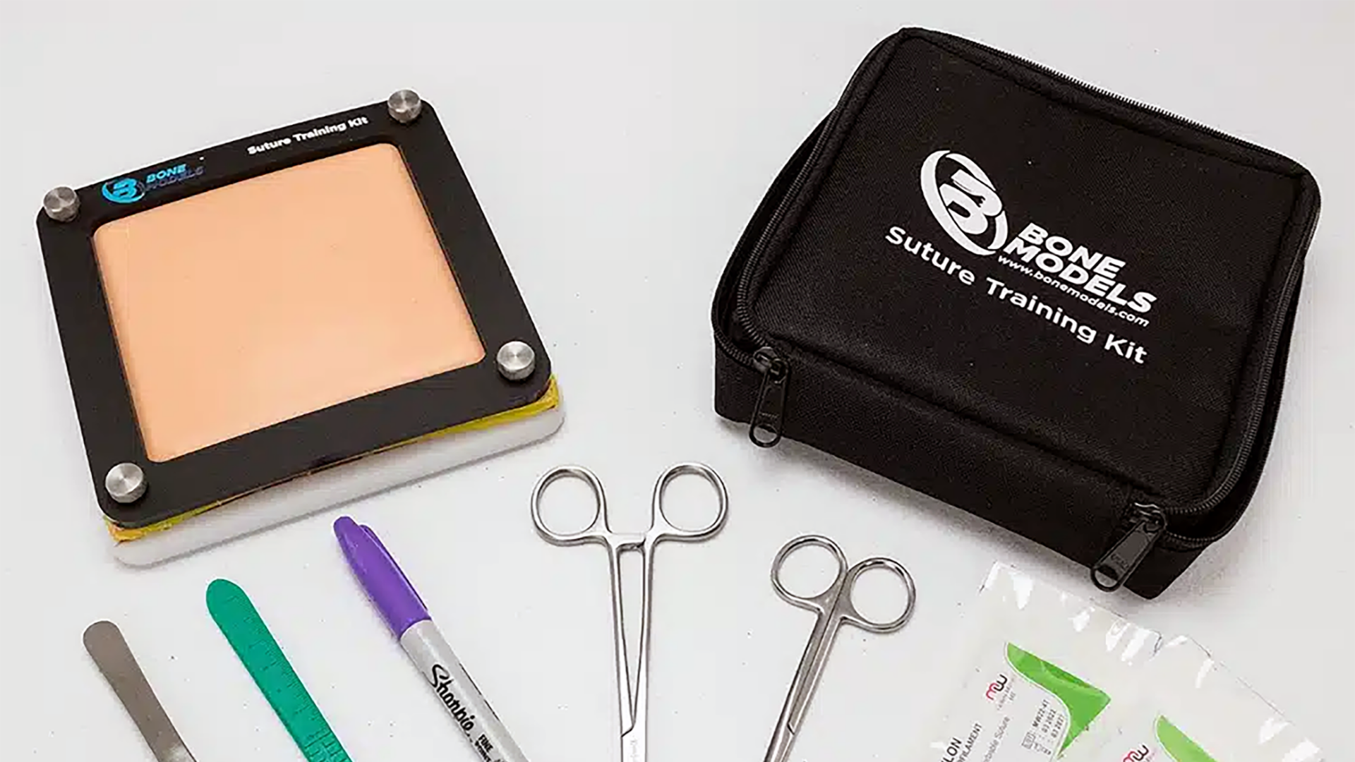
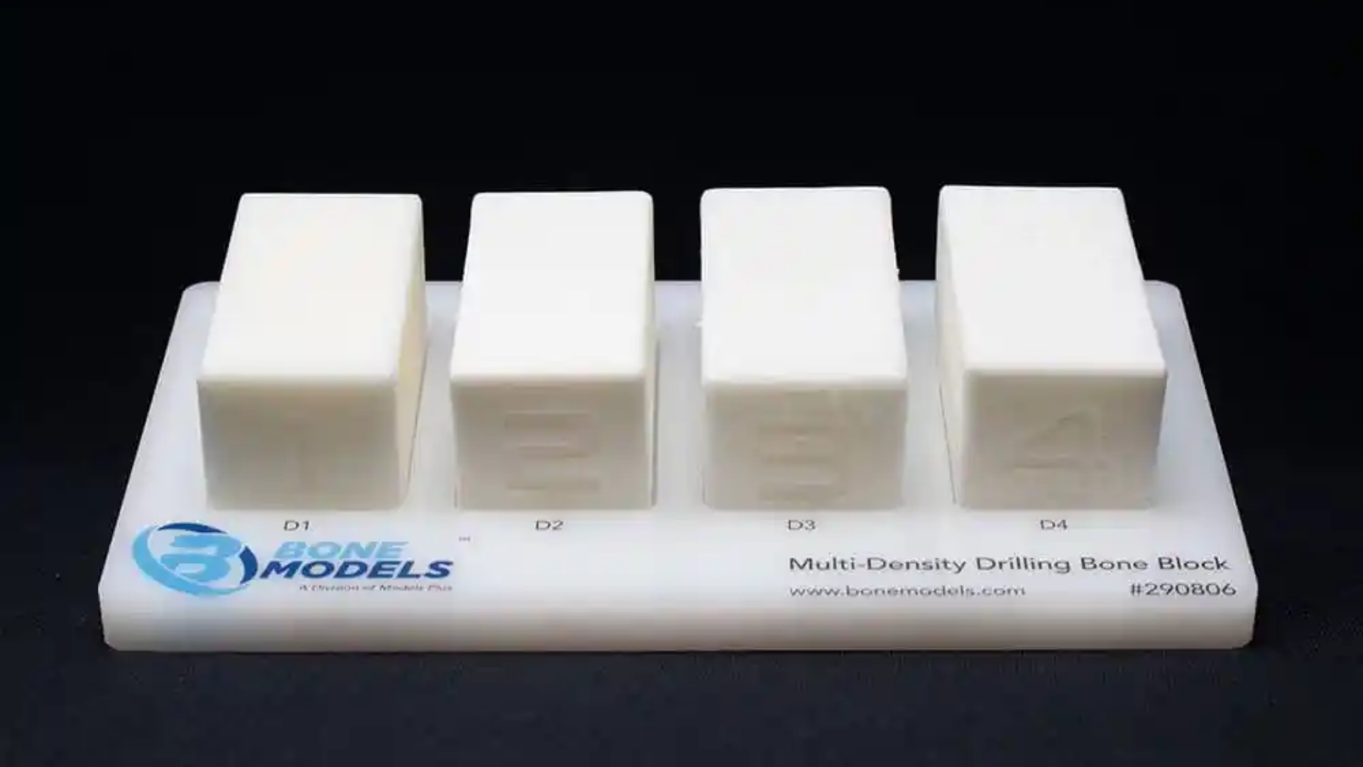
Applied Across Products and Tools
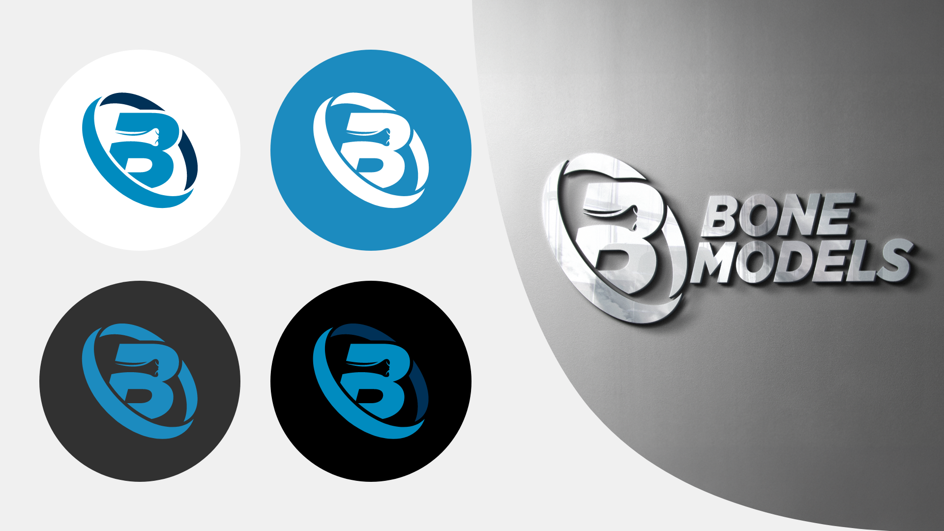
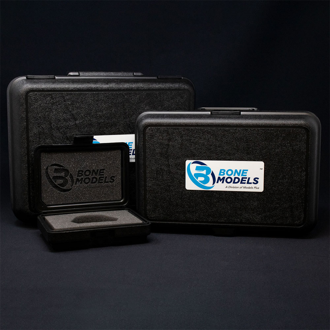
The new logo was designed with versatility in mind and applied across a wide range of physical products. From suture training kits and bone model traveling cases to packaging and other educational tools, the mark maintains clarity and impact at multiple scales. Seeing the logo in real-world use reinforces the brand’s professionalism while creating a cohesive, recognizable presence throughout the Bone Models product ecosystem.