A New Visual Language for Hope and Protection
ZOE International is a nonprofit committed to combating child trafficking and bringing hope to vulnerable children and communities around the world. For their first campaign of the year, ZOE sought a fresh visual direction for their monthly donation page and advertising materials. The visual strategy and design approach were crafted to foster a meaningful connection with donors and become a powerful symbol for the brand.
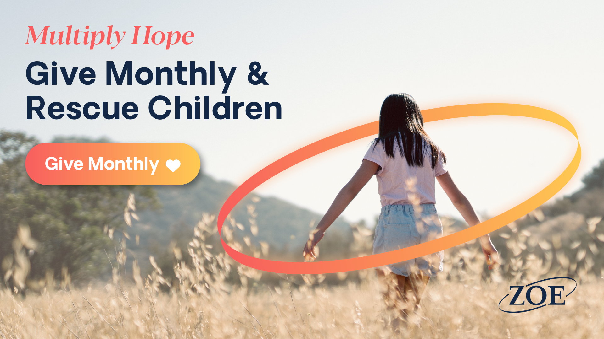
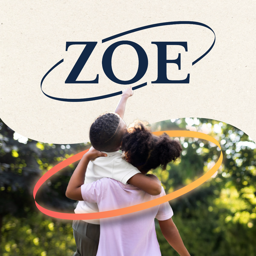
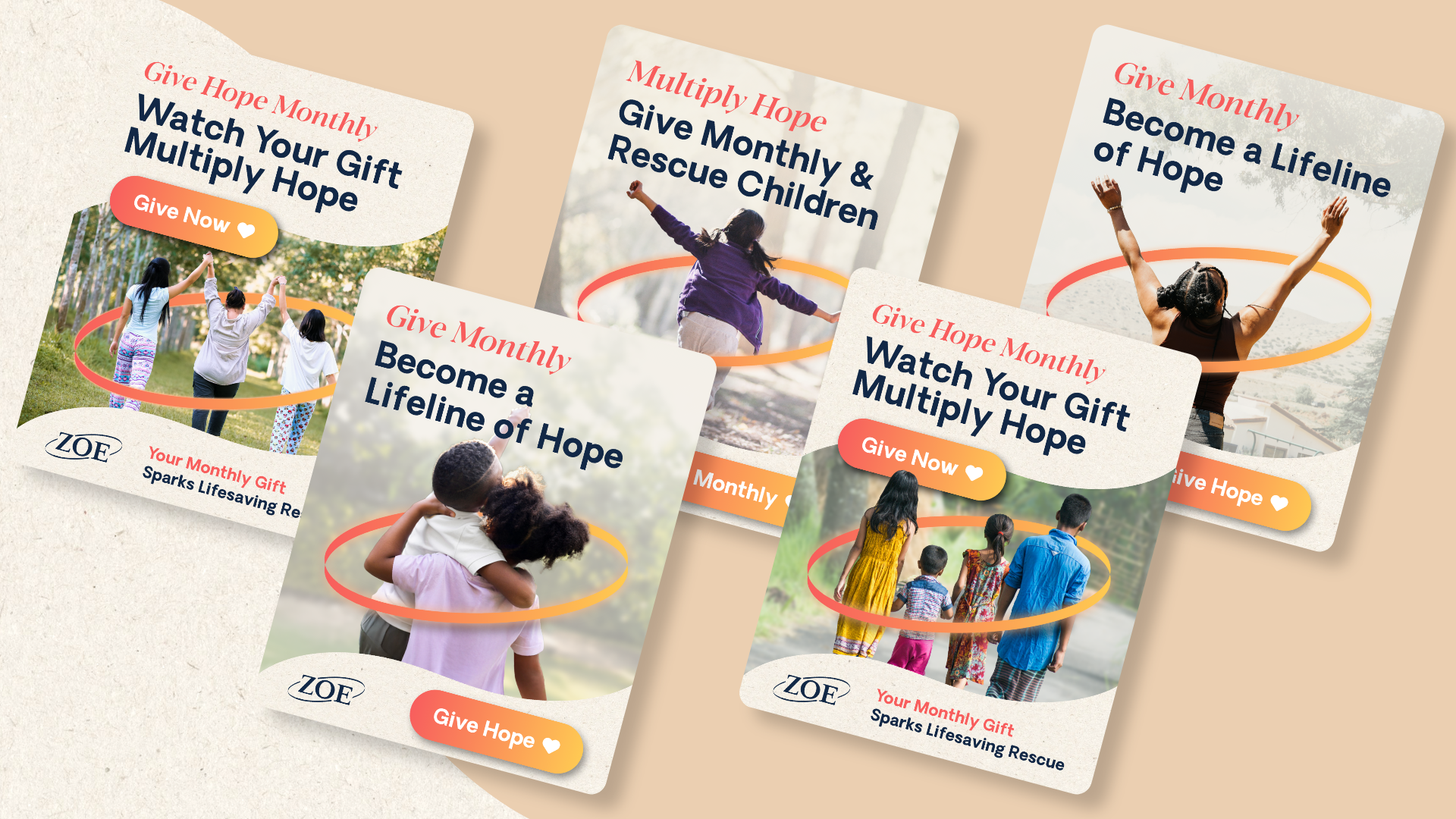
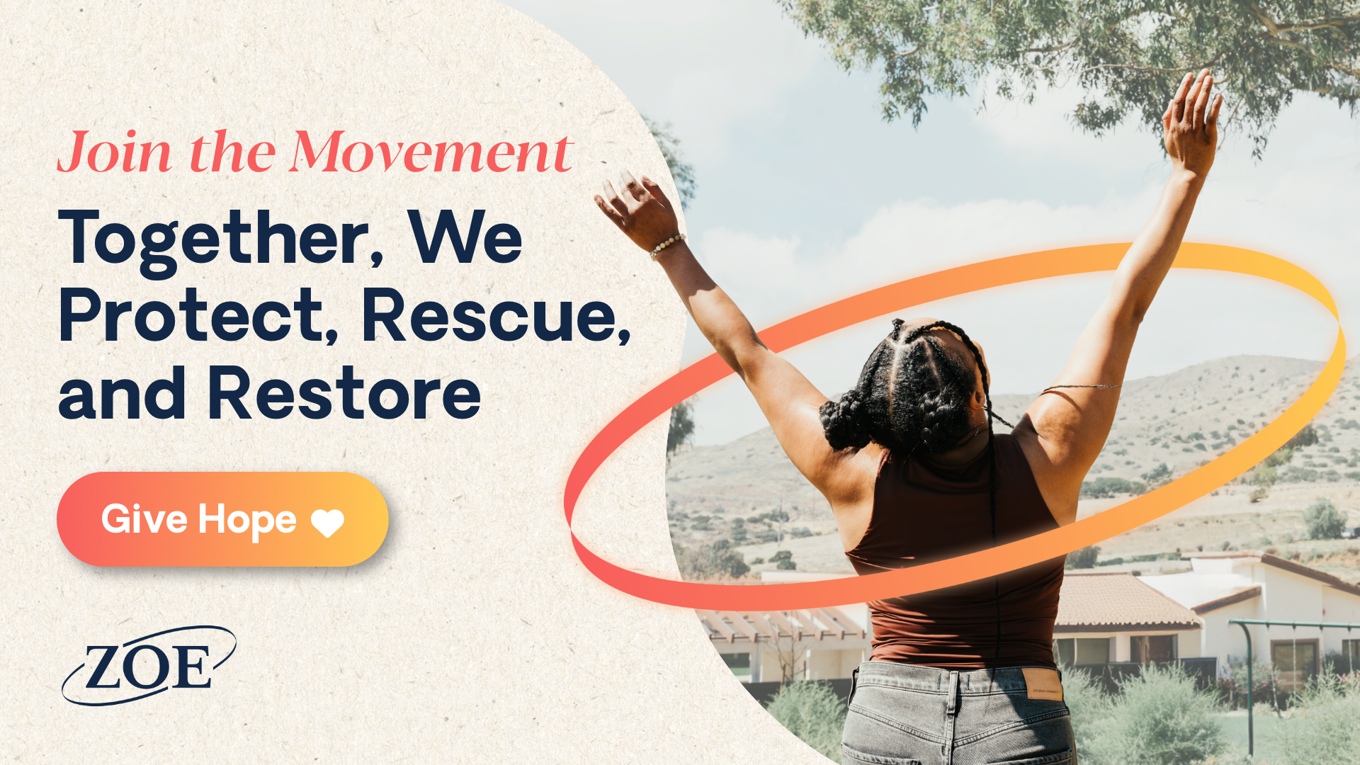
Transforming a Logo Element into a Symbol of Safety
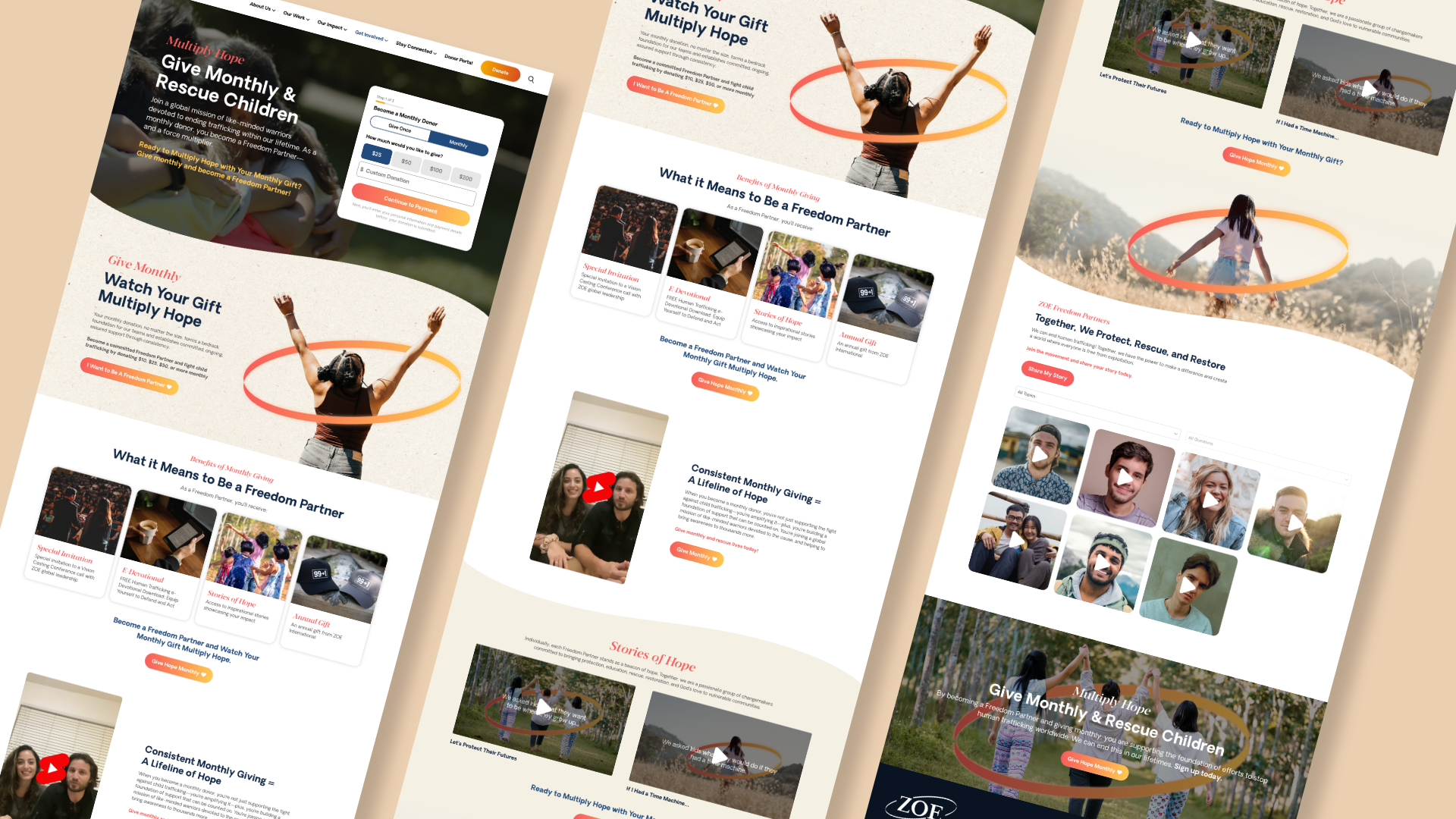
The ring motif from ZOE International’s logo was reimagined as a recurring graphic element, symbolizing protection. Warm peach and yellow tones form a circular frame around the children in the imagery, reinforcing themes of care, safety, and support.
A Donation Experience That Inspires Ongoing Support
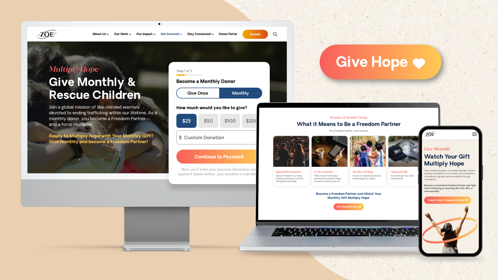
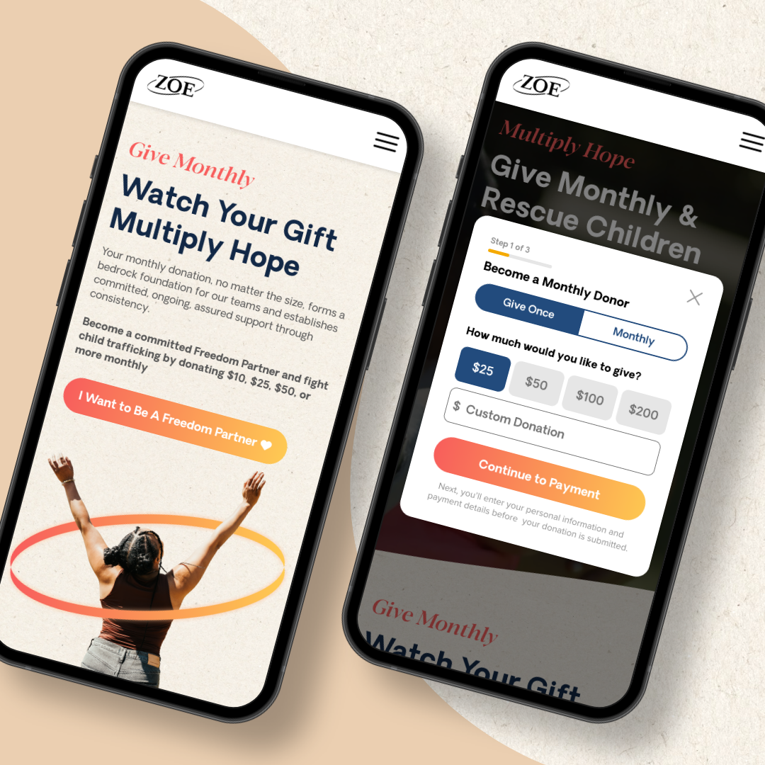
With the visual direction established, a new donation landing page was designed to bring the refreshed style and language to life. An engaging video header of children at play draws visitors in, while an above-the-fold three step donation form makes giving immediate and intuitive.
Below the fold, the page highlights the benefits of monthly support alongside video testimonials from current donors, sharing how their contributions have made an impact with ZOE International, all presented through soft paper textures and powerful imagery framed by the new symbol of safety.